

With digital traffic coming from both mobile and desktop devices, optimizing calls-to-action (CTAs) across platforms is essential to capture user attention and drive conversions. Here are the best practices for designing effective CTAs:
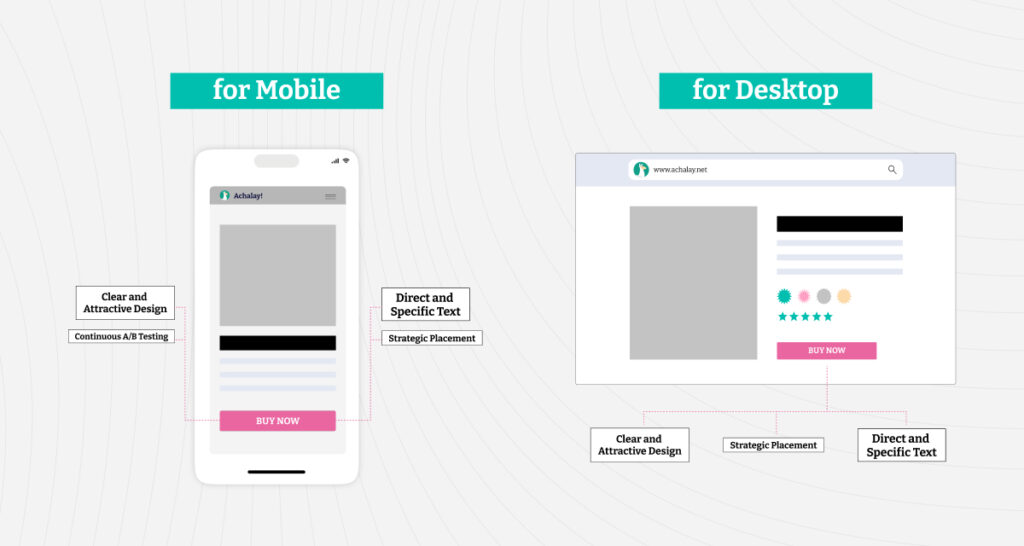
1. Strategic Placement
The placement of a CTA can make the difference between engaging or losing a user:
Above the Fold: Ensure the CTA is visible without scrolling, whether on smaller mobile screens or larger desktop displays.
Fixed or Floating Bars: Keep the CTA always visible as users navigate the page on any device.
Avoid Distractions: Position the CTA in a clean space without competing visual elements, regardless of screen size.
2. Clear and Attractive Design
The design of a CTA should be intuitive and visually impactful across all devices:
Large, Clickable Buttons: Ensure buttons are big enough for easy tapping on mobile and clicking on desktop.
Contrasting Colors: Use colors that stand out from the background while maintaining brand consistency.
Proper Spacing: Make sure CTAs are distinct from nearby elements, creating a clean and inviting design.
3. Direct and Specific Text
CTA text should be clear, persuasive, and suited for different user behaviors on mobile and desktop:
Concrete Actions: Use action verbs like “Buy Now,” “Download Free,” or “Reserve Your Spot.”
Immediate Benefits: Highlight what users will gain by clicking, adapting messaging to device-specific needs.
Localized Language: Tailor the tone and wording for your audience, no matter the platform.
4. Loading Speed and Optimization
Fast loading times and responsive designs are non-negotiable,
Avoid Heavy Elements: Minimize large images or scripts that slow down loading, especially on mobile. 🕒
Responsive Design: Ensure CTAs and landing pages adapt seamlessly to any screen size or orientation. 📐
5. Continuous A/B Testing
Experimentation is key to improving CTA performance on both mobile and desktop.
Colors and Placement: Test different button colors or positions to find the most effective option.
Varied Texts: Try different messages to see which resonates more with users.
Analyze Metrics: Measure CTR, conversions, and engagement separately for mobile and desktop to refine your strategy.
Examples of Effective CTAs
Here are some device-agnostic examples to inspire you:
E-commerce: “Add to Cart” with a bold, eye-catching button on mobile and desktop.
SaaS: “Try Free for 7 Days” displayed as a fixed bar for seamless navigation.
Educational Content: “Download the E-Book” with a clean design and clear benefits.
Conclusion
CTAs are more than just buttons; they’re the gateway to conversions. Whether on mobile or desktop, an attractive design, clear messaging, and constant optimization are essential for success. A good CTA not only guides users but also simplifies their path to action.
Ready to elevate your CTAs? Apply these practices and start seeing results across all devices.